 | |||
| A - that dark, noir feeling? |
 |
| B - a softer, more colourful look? |
 |
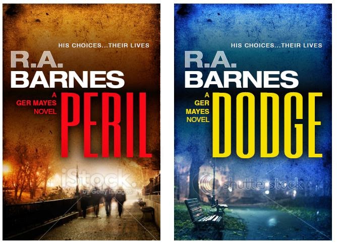
| C - a crisper, more colourful look? |
Please drop a comment below on this blog post, email me or leave your thoughts as a note if you enter Marble City's free prize draw for a Kindle Paperwhite plus leather cover. Much appreciated!
Ruby
A and C have that rookie Photoshop feel. B, however, is the dog's bollocks.
ReplyDeleteFirst impressions were B. Having read both, I think the B covers appeal to a wider audience (female, too) and hint at the literary style whilst still saying crime fiction. And I like the way the books seem more branded together. I do like the noir covers but there's something missing, for me. The colourful ones C: would be my second choice. Hope this helps!
ReplyDeleteI like B. They are a bit dark and give a feel of thriller.
ReplyDeleteMy gut reaction was C, which is more direct and says 'pick me up', but B is absolutely beautiful, much more subtle and looks classier.
ReplyDeleteAll of the covers are attractive and eye-catching, but none of the images clearly say crime. I like C the most. The fight shown on the C cover of Peril actually occurs in the book, which is a plus. The man on the bench on the C cover of Dodge doesn't say much. The blurb "his choices.. their lives" is pretty vague. In all the covers, I like to see the city in the background, with whatever tint. I love the look of European cities.
ReplyDeleteDon't like C, don't mind A, like B a lot.
ReplyDeleteI commented, but my comment has disappeared. I'm hoping it will reappear by magick.
ReplyDeleteNope, obviously not, so here goes again. I don't much like any of the covers, to be honest. For me, they are all too vague, too out of focus, and lack clear images. C (Peril) hints as a crime, but even that is too small and dark. Just my 2p, Ruby. I do like The Baptist hand and water, though.
ReplyDeleteI like all of them, but personally I'd go for B.
ReplyDeleteB's the one.
ReplyDelete"B" (I wrote a long comment, looked at it in preview, then the comment was deleted.)
ReplyDeleteB
ReplyDeleteThanks guys. Fairly strong votes for B on here. A was a dominant choice in a facebook readers' group. My original preference was C. So some rethinking required at my end :-)
ReplyDeleteI like B - just seems more interesting.
ReplyDeleteI love B. Definitely more likely to make me pick the book up
ReplyDelete